PRINT DESIGN
In this section, a member of the group was allocated to analyze 5 examples of film magazine covers, and 5 examples of horror movie posters relating to our genre. After this, we had to demonstrate Photoshop developments and different ideas for how we would present our final magazine cover and poster
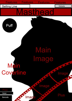
REAL MEDIA TEXTS: MAGAZINES

This is an example of an ‘Empire’ magazine. Although this magazine doesn’t normally cover horror films, I have chosen an example of this magazine’s styling because Empire usually uses a bold masthead, with a combination of long shots to feature the full costume of the main character. The font choice allows the magazine cover to appear very eye-catching and appealing. The font styling is designed to relate to the magazine’s main feature: ‘Inception’. This, in my opinion is a very creative way to specially design a magazine masthead, while keeping the same original, eye-catching design.
|

This is an example of a ‘Total Film’ magazine example. Like ‘Empire’, Total Film does not tend to feature horror films for their front page. Total Film front covers tend to feature a large image that uses direct address. These images are normally either mid shots or close ups, something which I have noticed on magazine front covers. What I find interesting about this particular front cover of Total Film is the ‘Plus’ section on the bottom of the magazine. Here they use a gold border with 4 images that are representative of 4 films that are also covered on the magazine.
|

The rest of my magazine examples will feature films that are of the ‘Slasher’ film genre, as the film concept that our group is working on is a slasher. This film’s feature: Nightbreed was marketed as a slasher horror film.
I like this magazine cover due to the close up the of the antagonist’s head. This shot allows the reader to gain an understanding of the type of character that is featured in the movie. The bright lighting that is focused on the character allows the picture to stand out from the rest of the front cover contents. This magazine typically features every outstanding, bold font for their masthead and main cover line. This makes the magazine very distinguishable from other horror magazines. This seems very typical of other horror magazine front covers, therefore, it is very likely that our magazine will feature a bold, outlined font for our masthead an cover lines. |

Here is another ‘Horror Hound’ magazine, which features the same bold fonts and colours. What I like about this front cover is that the colours that are used for the midshot main image allow the magazine to appear very abstract and appealing. These colours could serve as a representation of the overall mood of the slasher film ‘Texas Chainsaw Massacre’, to me these colours symbolise the crazy and complex character of the antagonist: Leatherface. This gives me an idea of how colours can be used to present a character’s mindset and emotion.
The main coverline is positioned at the bottom left, in order for the abstract image to not be covered. If our image requires the reader to view the costume of the antagonist, then it is likely that we’ll position the main coverline at the bottom. |

This is an example of a ‘Scream’ magazine. These magazines usually feature a mixture of cropped head shots which detail actors, characters and other aspects related to the horror film industry. What I find appealing about these magazines is the simplistic layout of the horror magazine conventions. While Freddy Krugar of the slasher horror film ‘A Nightmare on Elm Street’ is clearly the main feature of this issue of the magazine, the magazine also features the horror films, ‘REC 4’, ‘Blood on Satan’s Claw’, ‘V/H/S Viral’, ‘Wrong Turn 6’ and ‘The Drownsman’ while accompanying these features with images that are representative of the film or the actors. Like the ‘Total Film’ example, this is an idea of how our group can incorporate different images of characters or actors in our front cover.
|
REAL MEDIA TEXTS: POSTERS

All of my poster examples will be of slasher movies. The first example is for the film ‘Hatchet’ which features a close up shot of the main prop that is used in the movie. As the film poster does not feature any characters, the dark lighting and the glow around the edge of the weapon. Is used to catch the eye of the audience. The weapon shines, and details in order to make the weapon appear sharp, and intimidating. Taking inspiration from this movie poster, it is possible that we could use lighting in our poster in order to place emphasis on any props shown in the cover. It is possible that in our poster, we don’t include the antagonist, but instead a signature weapon that will be featured throughout the trailer.
|

This poster for ‘Friday The 13th’ Features a long shot of the antagonist: Jason Voorhees. In front of what appears to be a dark forest setting. The light that is exposed through the trees reflects onto the antagonist’s face, slightly revealing the intimidating, signature mask that horror fans know is linked to the character of the antagonist. The weapon is revealed slightly, helping the audience to see the weapon that would be used by the antagonist. The use of a long shot helps the audience to see the full costume that is used by the antagonist, allowing them to gain and understanding of the antagonist’s of character. The long shot also exposes the setting that the film is located in. The angle is slightly low, showing the intimidation of the character.
|

This is a poster for the slasher film: ‘Scream 4’ This is a simple poster that features the iconic masked antagonist: Ghostface. There is a slight reflection of light amongst the all black background. This would be a very effective choice of lighting if our antagonist is a character that wears all black, and a mask. The simplicity of this poster (in terms of the solid black background and white mask) adds to the intimidation factor of the antagonist, as it seems to represent how Ghostface lurks within dark areas.
The tagline: ‘New Decade. New Rules.’ Suggests that as opposed to the previous 3 ‘Scream’ films, there is something new or the audience to see. This is an effective way to give viewers the impression that even after 3 films, there is still more to bring to the franchise. |

This is the poster for the 2009 remake of the 1981 Canadian slasher film: My Bloody Valentine. While we don’t have the equipment to produce a 3D trailer, what captured me about this film poster is the use of a 3D effect to emphasize to pickaxe as a weapon. Despite not having 3D equipment, we can produce a 3D effect, with the use of Photoshop. This is help increase the intimidation factor of the antagonist.
What is also notable about this film poster, and in fact, all of the film posters that I have covered, is the use of a constant black, red and white colour scheme. Since these are very commonly used colours for film posters, it is very likely that our film poster (and perhaps our magazine) will consist of a black, red and white colour scheme. My understanding is that these three colours are representative of darkness and blood. Which are elements that are featured in the majority of horror films.
What is also notable about this film poster, and in fact, all of the film posters that I have covered, is the use of a constant black, red and white colour scheme. Since these are very commonly used colours for film posters, it is very likely that our film poster (and perhaps our magazine) will consist of a black, red and white colour scheme. My understanding is that these three colours are representative of darkness and blood. Which are elements that are featured in the majority of horror films.
DRAWN DRAFTS
MAGAZINE
In this section, we were to produce 4 drafts for our magazine and 4 drafts for our film poster, by hand drawing. These drafts, although they are not fully representative of our final products, demonstrate slight ideas of how we would detail our final products in the later stage.

My first example consists of the antagonist in a mid shot. I thought it was typical of horror magazines to feature the antagonist of their featured film on the front cover. The coverlines would be positioned on the areas where there are blank spaces, which is mainly on the left side of the page.

My third example consists of a character fighting off another character holding a visible knife from he corner of the image. The reader can assume that this is the antagonist attacking a character. I think this idea is effective as it shows the type of action that the audience could expect. However, like my fourth, I believe this idea appears more representative of a film poster, compared to a magazine cover.
|
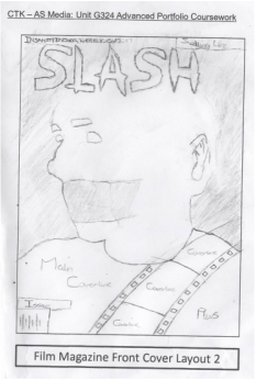
My second example consists of a character with tape over their mouth, this in my opinion is a reflection of the type of expectation that the audience should have for the film. I’ve seen a few magazines feature a character other than the antagonist for their feature image. I thought this was a good idea as it gives the reader knowledge of who is featured in the film.
My fourth example consists of the main protagonist in a close up shot from the side. If this shot were to be used, I would apply fake blood to the character’s face, as without it, the picture appears more like a poster than a magazine cover. The positioning is effective in my opinion, as it would allow the coverline positioning to be clear.
|
POSTER
Here are my 4 drawn drafts for our magazine.
I’ve attempted to come up with varied masthead titles for the magazine. All of which contain words which are somewhat related to the horror genre. The fonts chosen for the masthead are also of a horror type styling.
I’ve attempted to come up with varied masthead titles for the magazine. All of which contain words which are somewhat related to the horror genre. The fonts chosen for the masthead are also of a horror type styling.

My first example consists of a mid shot of the antagonist (the antagonists costume is currently blank as we’ve yet to decide on a costume for the antagonist) Like many other posters, I think this is effective as it allows the audience to get a glimpse of the intimidation of the antagonist. I want the image to feature direct address, as this also increases the intimidation factor. 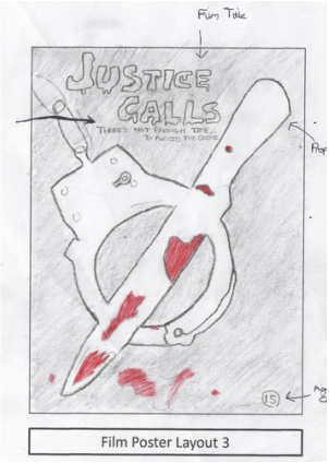
My third example features a high angle shot of two signature props to be used in the film: A set of handcuffs, and a bloody knife.
The handcuffs demonstrate the theme of the film, where the knife is an iconic weapon featured in the Slasher genre. This was my take of other movie posters, which feature the signature weapon of the antagonist. |
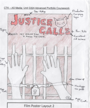
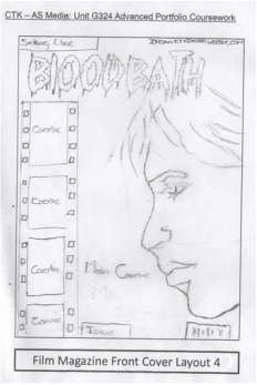
My second example consists of a close up of characters handcuffed hands, on a jail gate.
This gives the audience a picture of the setting that the film is set in, as well as an understanding of the props featured in the film. Like the other example, this example features a dark background; this sets the tone of the overall film, and allows it to seem like a horror. 
My fourth example features a close up shot of the antagonist, with his face partially covered by his costume.
I intend to have the costume reveal the antagonist. We may use a police-like uniform, along with a mask. Having the antagonists face partially shown through his costume builds to both the intimidation of the antagonist, and the mystery factor of the antagonist. |
Here are my 4 drawn drafts for our film poster.
All of these posters will in the end feature the same coverlines and elements, but in varied positioned, depending on where things are placed on the poster.
The credits will always either be placed at the top or the bottom of the magazine. And the star ratings and review quotes would be placed wherever there is the most available space.
DIGITAL DRAFTS
The simple digital drafts are fully dependent on the positioning of elements in my drawn drafts. The digital drafts detail approximately how much space would be taken by elements on the page, and their positioning.
MAGAZINE

Upon converting my first magazine drawn draft into a digital draft, I can conclude that this layout is very ideal for our magazine cover. I am able to insert all of the key features of a magazine cover, while still having space for more. Of my four magazine designs, I think this one is the most conventional.

I slightly altered this design for it to seem more horror-like. I like this design as it clearly shows one of the film characters, while having the signature knife in the background to represent the slasher sub-genre.
|
I wasn't completely sure if this design would work, but when I create it digitally, I think it does in a way match a standard magazine layout. My main concern is the positioning of the coverlines. What is slightly different about this design is the curvature on the section where the images will go. I could use this space to add cover-lines or simply other images in relation to our film.

This design is similar to the first, except that it would feature the main protagonist, as opposed to the antagonist. However, like the second, I think because the picture wouldn't feature direct address, it is slightly ineffective for a magazine cover.
|
POSTER

This design is the simplest of the four. The majority of the space in this poster is taken by the picture of the antagonist. Because of this, I think it may be a decent chose of layout, but it leaves little space for the other features.

While this poster may be less conventional compared to the others, has it would feature two props, I think this layout is nice as positioning the different elements of the poster was easy, because of the shape of the props.
|
Half of the poster space is taken by the picture. This leaves half of the space for the other features of the poster, making the layout clear and ideal. This layout left the most ideal position (in my opinion) to place the names of the actors featured in the film. This is something that we would need to consider for our posters.


This poster features the credits on the top of the page. I attempted to aim for a symmetrical appearance on this poster, since it is mostly the middle section that would be used by the image. I think this layout is the most organized.
|
DEVELOPED DIGITAL DRAFTS
MAGAZINES
For this section, I used my drawn drafts of both the magazine and the poster, and used silhouette shapes found on the Internet to represent the pictures. The next step was to use different typography, which will represent what we would use for our poster and magazine. We also had to use different conventions and clearly lay them out on our designs.
This section allowed me to better position the layers on the magazines and posters, in some cases, I found that some places worked better than others.
This section allowed me to better position the layers on the magazines and posters, in some cases, I found that some places worked better than others.

|

|

POSTERS


|


|
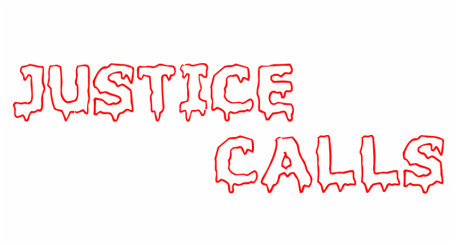
TYPOGRAPHY
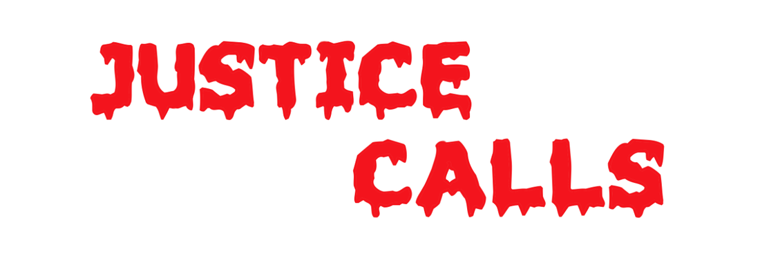
This font is the font that we initially believed we would use for our film title. I like this font as it as very easy to read, and still retains the horror aspect. All of the fonts will be used with a combination of red, as this it is very conventional for horror film posters to feature a bold, red font. This is because red connotes danger or blood.
I’m not sure what this font is supposed to represent. The sides of the letter remind me of bones in a way, so I think this is the type of font to be used in a ghoulish film. Therefore, this choice wouldn’t be appropriate for our film title.
|
This time, the font is similar to the first, but uses clear typography. This creates a less bold appearance, but still looks like a conventional horror font. I don’t think this font seems right for the slasher sub-genre; it looks more like the type of font used for an old ghost film.

This font is a nice choice as it is an iconic font, used in the film, ‘Friday the 13th’ however, it is because of this that I don’t want to use it for our film title, it doesn’t seem very unique to use a font already used by a widely known horror film.
|
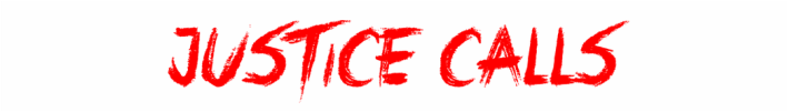
This font, I believe represents the slasher sub-genre as the edges of the letters appear very sharp and bold. This works very well with a red foreground and possibly and black stroke effect, to make the font appear bolder.
It is likely that we would either use the initial font choice, or the last.
It is likely that we would either use the initial font choice, or the last.
TEST SHOTS
We had the opportunity to take a few test shots for our products. Unfortunately, due to massive time constraints and lack of available props at the time, I was not able to take as many shots, and use as many props as I had planned to. These shots would work much better for the film poster, as opposed to the magazine cover.
