QUESTION 1 - WHAT WAYS DO YOUR PRODUCTS USE/DEVELOP/CHALLENGE FORMS & CONVENTIONS OF REAL MEDIA PRODUCTS?
Conventions are rules that are followed to help the audience recognise what type of media the product is and what genre it may belong to. For example, the slasher sub-genre have specific conventions that help the audience to identify that the product belongs to that genre. These conventions are important as it decides whether the audience consume the product or not.
Conventions can be followed, developed or challenged. Throughout this evaluation question, we will discuss conventions that our poster, magazine and trailer either followed, challenged or developed.
Conventions can be followed, developed or challenged. Throughout this evaluation question, we will discuss conventions that our poster, magazine and trailer either followed, challenged or developed.
HORROR SUB-GENRE CONVENTIONS
The chosen sub-genre of our film, 'Justice Calls' is slasher. The slasher genre has specific conventions that have to be followed, in order to be recognised by the audience and have the concept of a slasher film. Ensuring that our trailer was recognised to be from the slasher sub-genre, we had to research and find out what made a slasher film, a slasher film. We researched about the type of characters that were used, the settings, the costumes, the sound used in a slasher trailer and many other aspects .
The slasher horror sub-genre consists of the antagonist being a masked killer, out to kill a group of young adults which are the protagonists. The antagonist is usually male portraying dominant male characteristics. For example, fearless and intelligence. They use iconic weapons; which in fact gave slasher films their name; which symbolise their identity and use it to kill their victims. There is always a final girl who has a face off with the antagonist, wanting to kill him. The final girl is usually the sensible one out of the group whom refuses to take part in most of the activities. The films are usually set in isolated areas. For example, in the woods.
Antagonist - Masked Killer
The antagonists are large male characters that are portrayed as mentally disturbed or physically deformed who were traumatised as a child. They are usually male but their identity is often hidden by a mask. He does not say much throughout the film and is unstoppable. The fact they have been traumatised, explains their choice of victims, weapon and the location of the film.
In our own trailer, we ensured that the antagonist was male and that they had a mask to cover their identity. This is one convention that was followed in order for our genre to be pointed out by the audience.

|

|

|

|

|
|
|

|
|
Wes Craven 1996
|
Wes Craven 1985
|
Tobe Hooper 1974
|
Sean S. Cunningham 1980
|
Protagonist - Final Girl
Slasher films have a female survivor who is the final girl. She has characteristics that suggest she is not very feminine, allowing the male audience to relate throughout the movie. They are usually the good one, the virgin and very conservative. Their innocence is portrayed through this which brings them to being able to survive till the end of the film. In the end, they always have a scene with the antagonist, consisting of a confrontation where the antagonist is defeated.
Slasher films have a female survivor who is the final girl. She has characteristics that suggest she is not very feminine, allowing the male audience to relate throughout the movie. They are usually the good one, the virgin and very conservative. Their innocence is portrayed through this which brings them to being able to survive till the end of the film. In the end, they always have a scene with the antagonist, consisting of a confrontation where the antagonist is defeated.

|

|

|

|

|
|
|
|
Props - Iconic Weapons
Iconic weapons are those that are used by the antagonist and symbolise their character. This weapon is usually the same weapon that kills all the victims in the film, if not all then most.
Our antagonist had an iconic weapon of a batton. This is iconic to the character as it symbolises background; being a police officer.

|
|

|

|

|
|
|

|
Setting - Locations
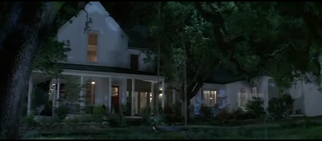
There are two main types of locations that are used in a slasher film; suburban neighbourhoods or isolated locations i.e. woods. Such areas are used because they are quiet and create an easy target for the antagonist.
The setting of our trailer was an isolated building with large rooms and large stair cases. This created good shots and portrayed some 'stock situations' within our trailer.
|

|

|

|

|
|
|

|
Protagonists - Group of friends
These are the additional characters that usually die during the film. They tend to be young, attractive adolescents made up of specific characteristic types. For example, the princess, the jock etc.
These are the additional characters that usually die during the film. They tend to be young, attractive adolescents made up of specific characteristic types. For example, the princess, the jock etc.

|

|

|

|

|
|
|

|
Costume
In most common slasher films, there is no set costume for many of the characters. The main characters however, usually have a different costume than the rest. The antagonist usually has a mask, specific clothing and a iconic weapon. The protagonist being the final girl, would usually dress in a different way to the rest of the female characters also. This is because of the dominant male characteristics she then takes on later in the film. We were able to order the police costume for the antagonist and the protagonist wore black trousers and a black hoodie.
In most common slasher films, there is no set costume for many of the characters. The main characters however, usually have a different costume than the rest. The antagonist usually has a mask, specific clothing and a iconic weapon. The protagonist being the final girl, would usually dress in a different way to the rest of the female characters also. This is because of the dominant male characteristics she then takes on later in the film. We were able to order the police costume for the antagonist and the protagonist wore black trousers and a black hoodie.

|

|

|
|
This is the police hat that we were able to purchase, which was worn by our antagonist.
|
This is the police badge that came with the hat, which was also worn by our antagonist. This was pinned onto a plain black shirt.
|
Here are the handcuffs that were also purchased with the two other props, which were also carried by our antagonist.
|
Characters
Looking at existing slasher horror films, we were able to identify that there would be two main characters; the antagonist and protagonist; and then other characters to make up the rest of the cast. The antagonist would usually be a male and the protagonist, female whom is the final girl. With though of this convention, we decided to do a similar thing by consisting similar character roles within our trailer.
Looking at existing slasher horror films, we were able to identify that there would be two main characters; the antagonist and protagonist; and then other characters to make up the rest of the cast. The antagonist would usually be a male and the protagonist, female whom is the final girl. With though of this convention, we decided to do a similar thing by consisting similar character roles within our trailer.

Marvin - Antagonist
|

Lucia - Brenda
|

Tobi - Abby

Kane - Max
|

Prescilla - Lian

Tomiwa - Trent
|
|
These are our two main characters. On the left is our antagonist who plays the police officer and to the right is our final girl.
|
These are the four stock characters (protagonists) that make up the group of teenagers, whom take part in illegal activities.
|
Length of trailer - 1:25
We followed the convention of the length of the trailer being between the time of one minute and one minute and thirty seconds. This is so much is not given away during the trailer but more so the best bits which intrigue the audience into watching it.
We followed the convention of the length of the trailer being between the time of one minute and one minute and thirty seconds. This is so much is not given away during the trailer but more so the best bits which intrigue the audience into watching it.
|
|
|
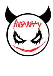
Justice Calls
Insanity Inc 2016 |
The Conjuring
James Wan 2016 |
Sound
The use of silence, bangs and drones create tension, suspense and fear for the audience. Doing so creates shocked reactions from them if done correctly. We used The Gallows soundtrack to help guide our sound for our own trailer. This convention of sound was developed throughout our own trailer.
The use of silence, bangs and drones create tension, suspense and fear for the audience. Doing so creates shocked reactions from them if done correctly. We used The Gallows soundtrack to help guide our sound for our own trailer. This convention of sound was developed throughout our own trailer.
|
|
|
|
Justice Calls
Insanity Inc 2016 |
The Gallows
Travis Cluff 2015 |
POSTER CONVENTIONS
To ensure that our poster appeared to be similar to other existing posters, we did some research into real movie posters. We were able to identify many conventions that existed on posters which allowed us to apply it to our own. Below are also conventions that we have followed, developed and challenged. For each poster, we cut it into different pieces, so that we could point out specific features that were portrayed on each one. We have also done this for our own movie poster to show the similarities and differences.

|

|

|
|
House of Wax
Jaume Collet-Serra 2005 |
Smiley
Michael J.Gallagher 2012 |
Justice Calls
Insanity Inc. 2016 |
As you can see, the main conventions of a poster are: credits, company logos, website, "coming soon" or the release date, tagline, the films title, actor names, subject or imagery, review quotes, festival awards/nominations and pull quotes. Not all conventions are used on posters but the vast majority are. This is so the audience can clearly identify with the poster finding out as much information as possible by the little amount that is shown. Therefore, real movie posters also challenge or develop conventions to suit their audiences needs.
|
As our sub-genre was slasher, looking at existing posters from that specific genre, helped us to create our final piece so that it appeared to be of a slasher genre. Here are a few slasher film posters that helped us to create our final product.
We used all posters conventions by following them, developing them or challenging them. Following the conventions enabled the poster to have a clear structure and layout, making it easy to identify. Developing conventions are important also, so the poster is able to suit the targeted audience. Challenging conventions are good as it create a unique appearance for the poster, making it different from others. Also, by looking at posters from other genres, we were able to incorporate other conventions that worked well.
|
|


SPECIFIC CONVENTIONS FOLLOWED, DEVELOPED OR CHALLENGED
THE MAIN IMAGE CONSISTING OF ONE CHARACTER

|

|

|
CONVENTION FOLLOWED - HAVING ONE CHARACTER ON THE POSTER CREATES A FOCUS ON THAT SPECIFC CHARACTER.
THE RELEASE DATE HAVING AN ACTUAL FIGURE DATE OR 'RELEASING SOON'

|

|

|
CONVENTION DEVELOPED - THE DECISION INTO PUTTING 'COMING SOON' WAS MADE IN REGARDS TO CREATE SUSPENSE AND A TEASE FOR THE AUDIENCE
PLACING THE CAST AT THE TOP OF THE POSTER

|

|

|
CONVENTION CHALLENGED - ON MANY POSTERS WE LOOKED AT, THERE WERE NO CAST NAMES AT THE TOP OF THE POSTER SO WE DECIDED TO INCLUDE IT. THIS WAS SO THERE WAS NOT ANY UNSIGHTY GAPS ON THE POSTER.
MAGAZINE CONVENTIONS
Magazine conventions help structure the layout of a magazine. We were able to do some research into existing magazines to find out the conventions that are used throughout horror magazines. We then was able to apply this to our own magazine.

|

|

|
Conventions
Masthead: The title of the magazine cover and is the largest font on the cover. This is to stand out and so the audience know who it is by.
Selling Line: This is usually at the top of the magazine as it encourages readers to purchase it.
Main Image: Can sometimes be the only image on the front cover and is usually the largest if there are more. It is the main story that is included inside the magazine.
Left-third: This consists of cover-lines, additional images, a plus section, barcode and website. This is the section that is displayed in shop shelves.
Main cover-line: This links to the main image and tells the audience about the main story.
Cover-lines: Other information on the cover that tells the audience what is inside.
Date/Price: Tells the audience when the magazine was published and how much it costs.
Barcode: To scan in the shops.
Website: For the audience to get further information.
Colours Used: These are the main colours that are used on the cover.
|
Horror Hound
The Exorcist |
Scream
Evil Dead |
Fright
Justice Calls |
Above is a existing magazine cover with conventions. Below that is our own magazine cover with similar conventions. Some of these conventions have been followed and also developed further to suit the needs of the audience in making it appear more attractive and unique. We followed conventions such as the masthead being the largest typography on the page. We also followed the convention of having the selling line at the top of the page, consisting of similar items that would be inside the magazine to draw the audience's attention. Doing so enabled the magazine to have the structure of existing ones.
There were conventions that were developed also. The price of the magazine; we decided to place with the barcode and the website instead of the date. This being because of the left-third having more value on shop shelves and more noticed.
We challenged the left-third and the cover-lines by placing them at the bottom of the magazine, below the main cover-line. We decided to do this so our magazine looked more unique compared to other magazines where their cover-lines are on the left-hand and right-hand side.
Overall, the majority of the conventions, such as the main image relating to the main cover-line, including a barcode, website and date were followed to structure the cover.
When looking at existing magazine covers, we identified specific conventions that we thought worked really well in giving it its clear layout and attractive appearance.

|

|

|

|
|
On this magazine, we identified that we liked the cover-lines in the right hand corner of the page.
|
We identified that we liked the simple, blocked typography.
|
We liked the use of the colours on this cover.
|
On this cover, we liked the left-third consisting of other images as well as the main image.
|
Having identified these specific conventions, we were able to corporate them into our final product.
SPECIFIC CONVENTIONS FOLLOWED, DEVELOPED OR CHALLENGED
THE LEFT THIRD CONSISTING OF THREE IMAGES

|

|

|
CONVENTION DEVELOPED- ALL THREE IMAGES LINK TOGETHER AND ARE NOT OF CHARACTERS BUT BEHIND THE SCENE SHOTS
THE MASTHEAD BEING THE BIG AND BOLD

|

|

|
CONVENTION FOLLOWED - WE WANTED OUR MASTHEAD TO BE BIG AND BOLD SO IT WOULD STAND OUT FROM THE REST OF THE MAGAZINE
COVER-LINES BEING AT THE BOTTOM OF THE COVER PAGE

|

|

|
CONVENTION CHALLENGED - PLACING THE COVER-LINES AT THE BOTTOM OF THE PAGE TO CREATE A USP (UNIQUE SELLING POINT).
TEASER TRAILER CONVENTIONS
The purpose of the horror film genre is to create a sense of fear and panic for the audience. Therefore, creating a trailer before the actual film comes out, is to encourage the audience to watch the film. There are specific conventions that help make horror film trailers, good trailers. Conventions such as lighting, costumes, props, setting, editing, characters, pacing, length, camera techniques and so on enforce a good horror trailer. To specifically relate back to my our sub-genre, Slasher, the trailer will have to consist of the specific conventions to help enforce the slasher genre.
|
|
|
|
Here is our film trailer beside the two trailers we used to help edit our own. We used Wes Craven's 2011 Scream 4 trailer and John Carpenter's 1978 Halloween trailer. They are both from the slasher sub-genre and therefore portray the necessary conventions needed to make our trailer.
|

|

|

|
|
A wide shot was used in the Scream trailer to portray the film company name in which we also decided to portray the same with our film company's name and logo, using the same shot. Including the company's name/logo is a convention that all trailers use which is why we followed this.
|
This shot is similar to the previous one; it being a wise shot and showing the film's title in large, bold typography. This is for the audience, enabling them to know the name of the film. The title of the film is a convention that we decided to follow.
|

|

|

|

|
|
|
|
Here are shots of captions that help explain the narrative of the film in as little detail as possible. The first four are those used in our own trailer and below are ones used in Scream. The use of captions in a trailer is a convention that we decided to follow in order to help deliver the narrative. However, we were able to develop this convention further. This was by making our own captions much shorter than those from the Scream trailer. We chose to do this because we felt that they would be remembered by the audience better as they were short and quick phrases.

|

|

|

|
Here are four mid-shots of the antagonist in the film Scream.

|

|

|
Here are three shots of the antagonist in the film Halloween. The first shot is a long shot as the audience is able to see the character in the far distance. The second shot is a high angle, wide shot. The third shot portrays the antagonist from the protagonists point of view (POV). This is from a low angle.
Portraying the antagonist in the trailer is a convention that can be followed, developed or challenged. This is in terms of how often the antagonist is highlighted throughout the trailer for the audience to know or if the character is not highlighted at all to create suspicion.
Portraying the antagonist in the trailer is a convention that can be followed, developed or challenged. This is in terms of how often the antagonist is highlighted throughout the trailer for the audience to know or if the character is not highlighted at all to create suspicion.

|

|

|

|
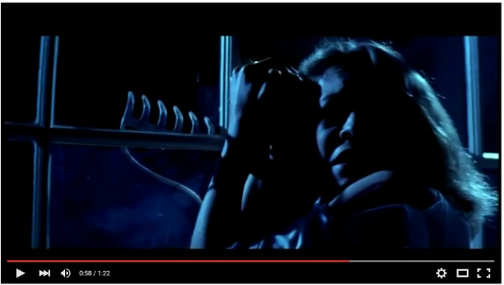
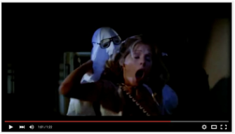
Here are four shots of our antagonist from our own trailer. The first shot is a close-up, the second shot is a low angle, the third one is a low angle and the final shot is a extreme close-up. By following the conventions of showing the antagonist, adds to the trailer attracting the target audience which is important.
|
|
|

|

|

|
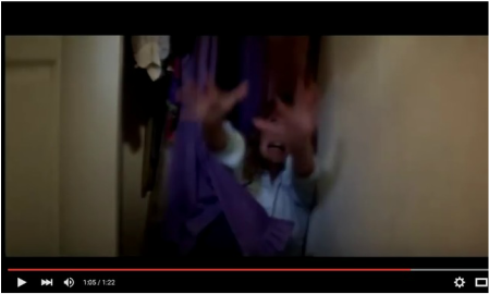
Three different shots showing the protagonists. It is a common convention that these characters are portrayed within the trailer and it is a convention that was followed by us. We decided to follow this convention as it was one that worked well in allowing the story to be told fluently. Also, portraying different characters through different camera angles, for example close-ups or high angle, helps the audience to identify with them.

|

|
In the first shot, the character is falling to the ground to signify a stock situation which is apart of a theory that we had learnt, which is related to the slasher genre. We then looked at further horror films/trailers and found that such situations were commonly used in slasher horror films. This is why we decided to include one in our own trailer.
There are many ways that our final products were able to follow, develop and challenge the conventions of existing media products. We now have a clear understanding of how conventions structure products in allowing them to be easily identified by the audience.
